

Big Six Away Kit Ranking 2025/26
(Image credit: Adidas / Liverpool)
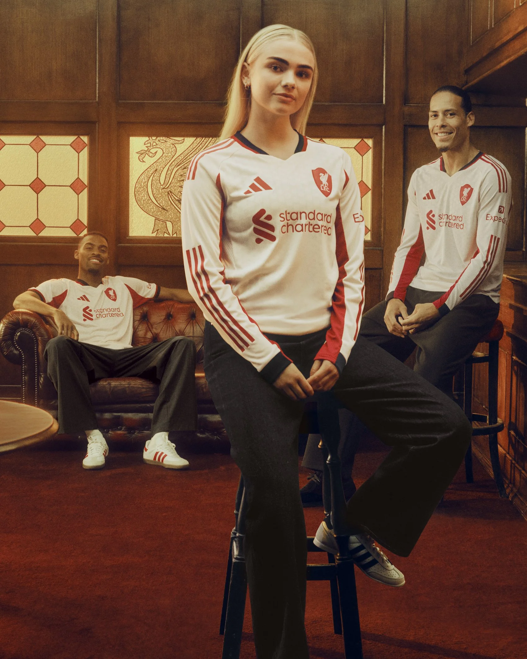
6th: Liverpool
The Liverpool 2025/26 away kit features a redesigned Liver bird shield for the badge, giving it a distinctive touch compared to the home kit. Ranking it 6th may seem a little harsh, but I’m not a big fan of the integrated green and red collar or the gap between the iconic Adidas three stripes on the sleeves. Liverpool have produced some truly unique and eye-catching kits over the years, but for me, this one doesn’t quite live up to some of their previous designs.

(Image credit: Adidas / Arsenal)
5th: Arsenal
Another tribute to the classic 1995–96 lightning strike away kit worn by greats like Dennis Bergkamp, this year’s design offers a more modern rework of that iconic look. The cannon crest is a unique touch and one I really like, but I’m not entirely convinced by the combination of black, white, red, and blue. The collar also appears to feature a slightly different shade, which doesn’t blend particularly well with the sleeves. Despite that, it’s still a distinctive Arsenal kit that I quite like overall, and one I would generally rank fairly highly among the rest of the league.
(Image credit: Adidas / Manchester United)
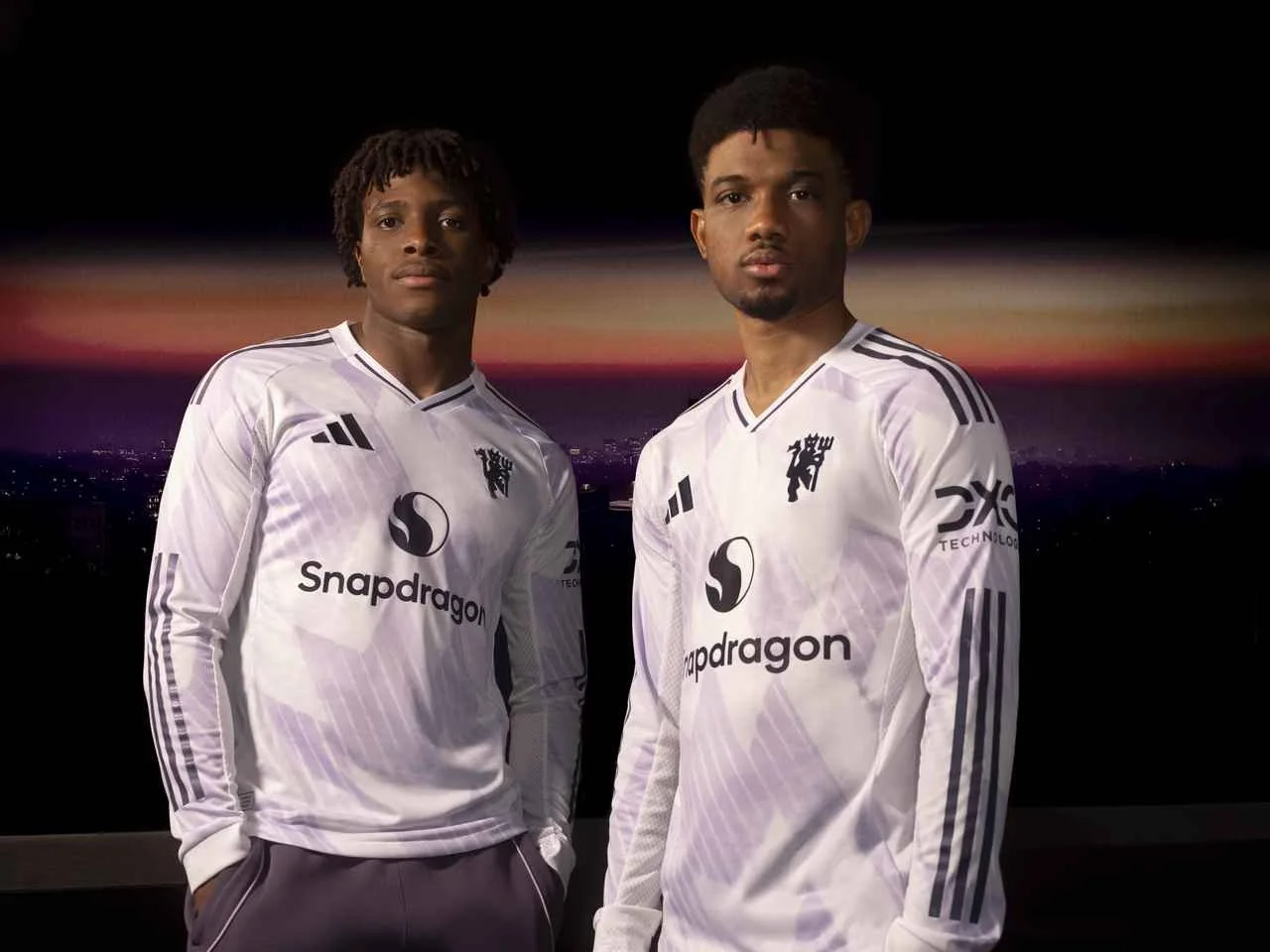
4th: Manchester United
With a clear tribute to the 1990–92 “snowflake” away kit, this version offers a more washed-out interpretation, with the snowflake design appearing as a subtle background pattern with a faint metallic lilac finish. It’s a clean and well-executed rework that makes the kit easy on the eye. The purple and white combination provides a more unusual colour scheme for Manchester United, while the devil-with-trident badge is a clever addition. The Snapdragon sponsor also gives off a throwback feel to the Vodafone sponsor United wore in the early 2000s, something that feels very much rooted in retro football shirt culture.
(Image credit: Tottenham Hotspur FC)
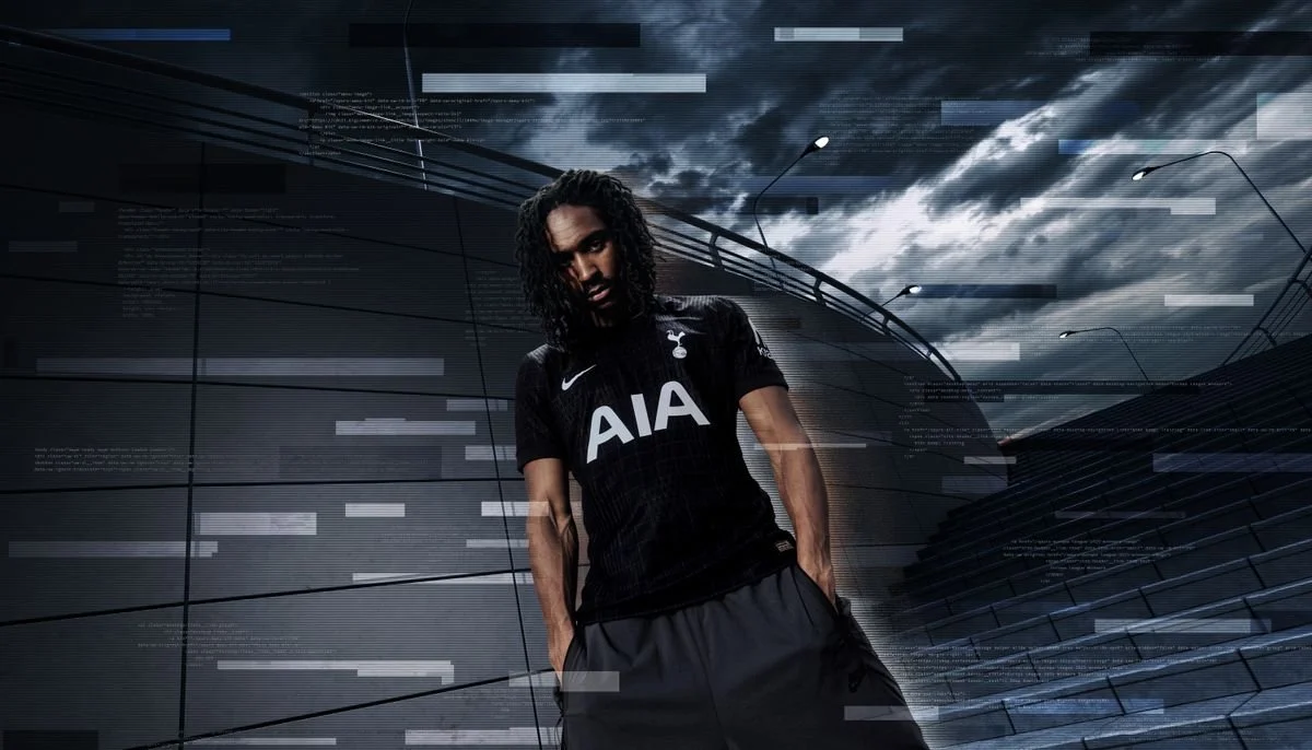
3rd: tottenham hotspur
Despite being a fairly standard and far from unique design, I’ve always been a big fan of the more aesthetically pleasing, understated football kits. The classic Nike swoosh paired with Tottenham’s famous AIA sponsor creates a sleek combination that, for me, makes this a great-looking shirt. The subtle squared pattern works well with the black and white colour scheme, and the kit definitely reinforces the dramatic tagline introduced alongside it: “In darkness, we dare.” Personally, I tend to prefer less loud designs, so this sleek look ranks higher for me than the more unique and vibrant kits from the previous three teams.
(Image credit: Chelsea FC)
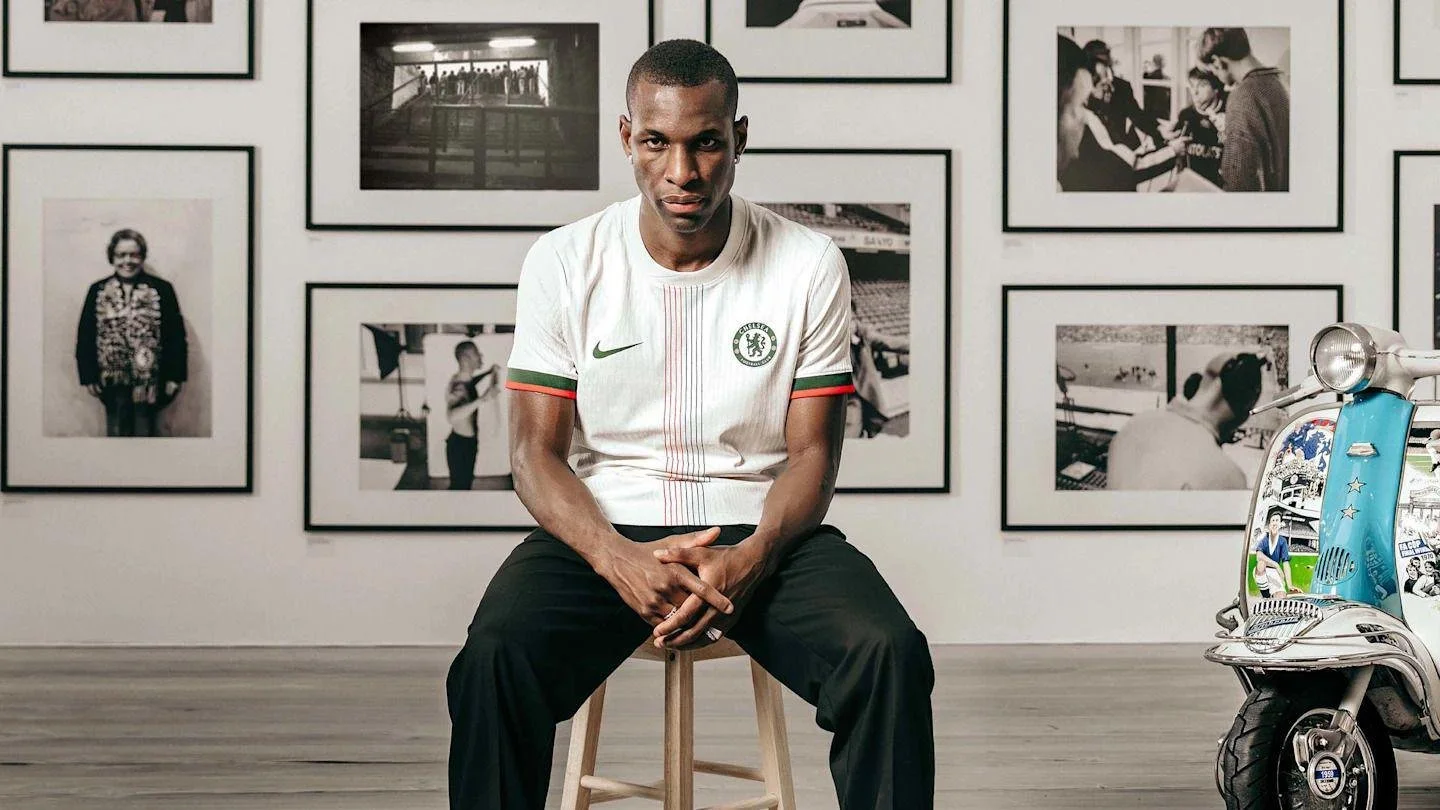
2nd: chelsea
Chelsea and white away kits have gone hand in hand over the years, but I think this is one of their better ones in recent seasons. The muted green and red detailing serves as a visual reference to the club’s 1974–75 away shirt. I like the central stripe, which ties in nicely with the colouring on the sleeves. Chelsea often opt for sleeker, more understated designs, and the absence of a sponsor adds to that clean look. Overall, I think they’ve achieved that balance well, and for me this is one of the better away kits I’ve seen this season.
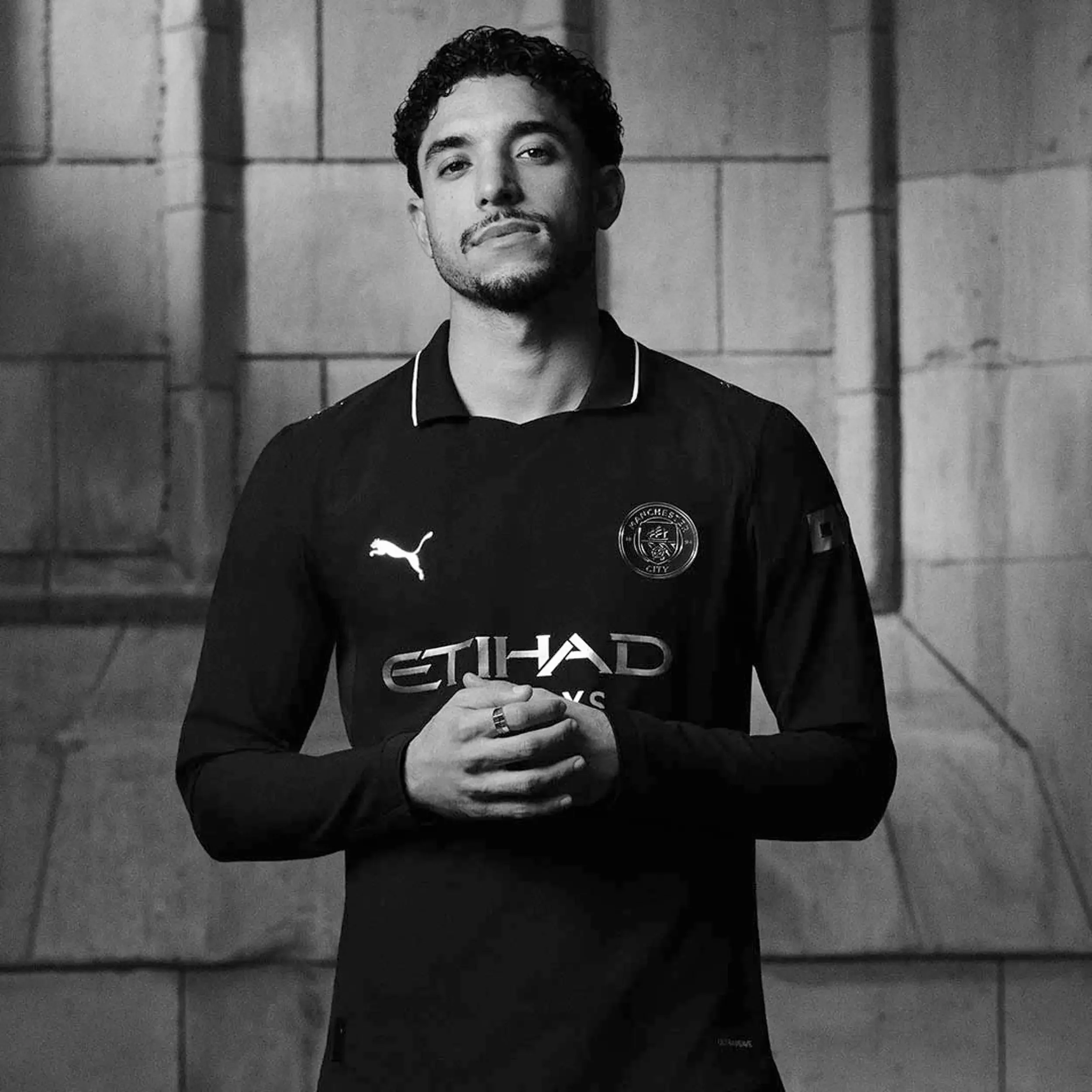
(Image credit: Manchester City FC)
WINNER: MANCHESTER CITY
For me, this is the standout kit among the Big Six sides. Puma have done an excellent job designing Manchester City kits in recent years, and this is another strong example. The design is inspired by the very first kit believed to have been worn by the club during their formative years as St Mark’s (West Gorton) FC in the suburbs of Manchester. This modern reworking is extremely stylish, particularly with the metallic trim that adds a premium feel. The low-opacity badge helps create a clean overall design, while the subtle white lining on the collar adds a nice finishing touch. For me, this is the best away kit produced by any of the Big Six clubs this season.